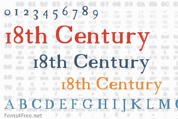

I had trouble finding pictures of actual texts from the 18th Century, I resorted to my history book, which had no Q's, Z's, and nearly no punctuation, so I improvised. If you happen to run across an 18th Century text, and find out that I screwed up the Q's or what not, sorry.
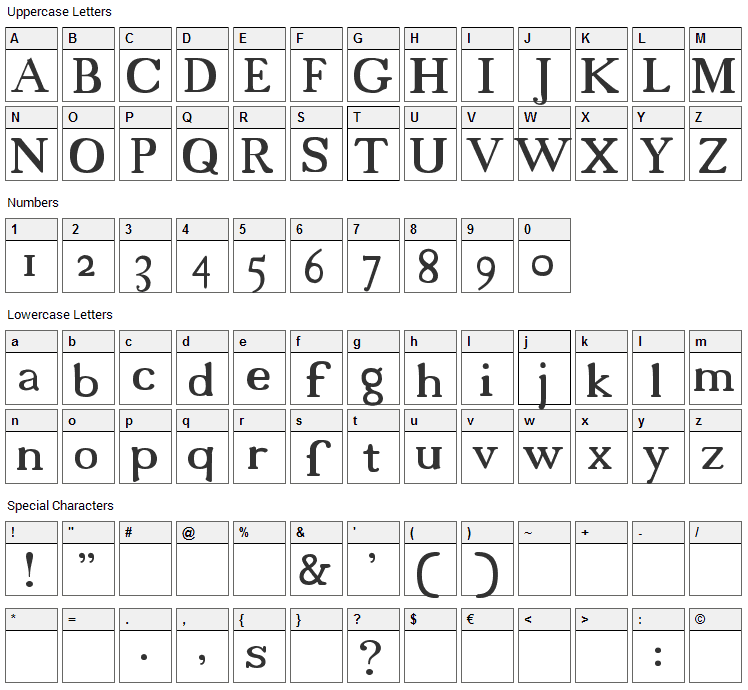
You'll notice the small S's look life f's. All small S's within and at the beginning of words look look like f's. All S's at the end of words looks like regular s's. I made left braces "{" regular S's. Also, I made left and right brakets "[", "]"... "fi" and "si", because in the old texts they sort of merge together or whatever. If you care, in the 18th Century, they use italics for some proper names, change font sizes alot, and throw in handwritten and gothic looking words sometimes. oh, and when using all caps, put a space between each letter.

18th Century font contains 78 defined characters and 77 unique glyphs.
The font contains characters from the following unicode character ranges: Basic Latin (77), Latin-1 Supplement (1).
- Font Name:New
- Subfamily:Regular
- Version:Version 1.00
- Trademark:Trademark
Submit a comment, question or review about 18th Century font


No comments yet. Be the first to comment.