
Around 1800 (100 years before Helvetica and Univers) the first Sans Serif typefaces to include lowercase letters used to have very High Contrast (the difference between thick and thin lines). Maybe because the were derived from the more traditional serif typefaces of the time.
But for same reason, as the genre evolved, the fashion was to create 'monoline' sans, of very little contrast. Today, contrasted Sans are very rare, and only a few are successful.
While digging in old specimens, we found three that immediately caught our attention: Doric Italic and Taylor Gothic from American Type Founders (1897), and Charter Oak from Keystone Type Foundry of Philadelphia (1906).
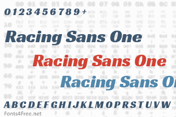
Racing Sans is a current high contrast sans, paying tribute to this forgotten genre.

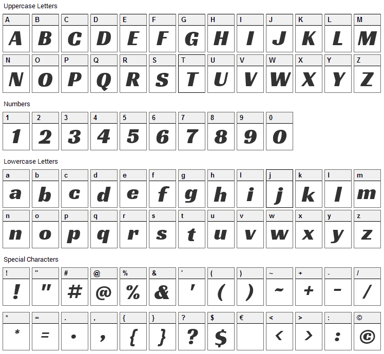
Racing Sans One font contains 440 defined characters and 325 unique glyphs.
The font contains characters from the following unicode character ranges: Basic Latin (93), Latin-1 Supplement (96), Latin Extended-A (127), Latin Extended-B (27), IPA Extensions (1), Spacing Modifier Letters (9), Greek and Coptic (1), Latin Extended Additional (34), General Punctuation (16), Superscripts and Subscripts (17), Currency Symbols (1), Letterlike Symbols (1), Number Forms (6), Mathematical Operators (3), Private Use Area (1), Alphabetic Presentation Forms (6).
- Font Name:Racing Sans One
- Subfamily:Regular
- Version:Version 1.001; ttfautohint (v0.8) -G 200 -r 50
- Trademark:Racing Sans is a trademark of Pablo Impallari
- Manufacturer:Pablo Impallari, Rodrigo Fuenzalida
- Designer:Pablo Impallari, Rodrigo Fuenzalida
- Vendor URL:www.impallari.com
- Designer URL:www.impallari.com
- License:This Font Software is licensed under the SIL Open Font License, Version 1.1. This license is available with a FAQ at: http://scripts.sil.org/OFL
- License URL:http://scripts.sil.org/OFL
Around 1800 (100 years before Helvetica and Univers) the first Sans Serif typefaces to include lowercase letters used to have very High Contrast (the difference between thick and thin lines). Maybe because the were derived from the more traditional serif typefaces of the time. But for same reason, as the genre evolved, the fashion was to create 'monoline' sans, of very little contrast. Today, contrasted Sans are very rare, and only a few are successful. While digging in old specimens, we found three that immediately caught our attention: Doric Italic and Taylor Gothic from American Type Founders (1897), and Charter Oak from Keystone Type Foundry of Philadelphia (1906). Racing Sans is a current high contrast sans, paying tribute to this forgotten genre.
Submit a comment, question or review about Racing Sans One font


No comments yet. Be the first to comment.