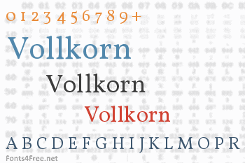

Vollkorn came into being as my first type designing attempt. I published the Regular in 2005 under a Creative-Commons-License. Until the counter finally collapsed two years later it had been downloaded thousands of times and used for web and print matters. It intends to be a quiet, modest and well working text face for bread and butter use. Unlike its examples in the book faces from the renaissance until today, it has dark and meaty serifs and a bouncing and healthy look. It might be used as body type as well as for headlines or titles. »Vollkorn« (pronounced »Follkorn«) is German for »wholemeal« which refers to the old term »Brotschrift«. It stood for the small fonts for every day use in hand setting times.

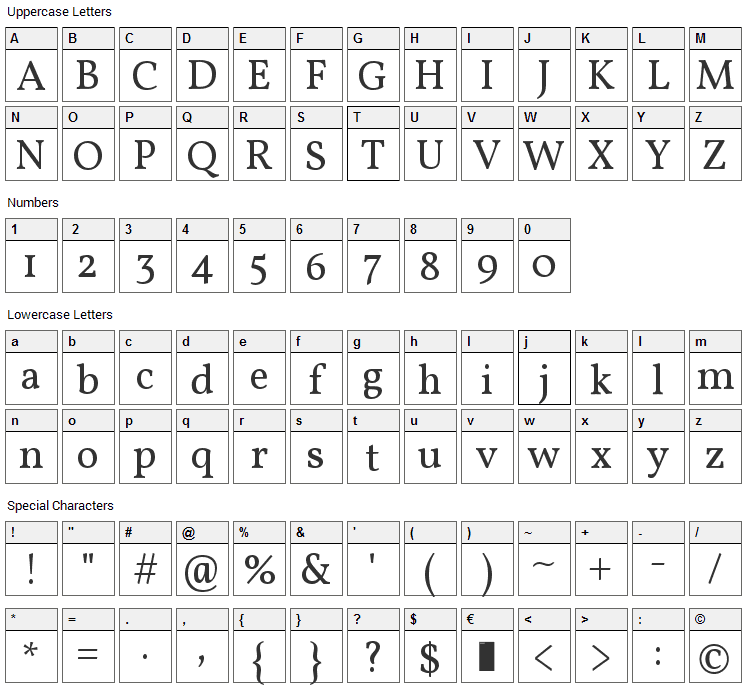
Vollkorn font contains 230 defined characters and 189 unique glyphs.
The font contains characters from the following unicode character ranges: Basic Latin (93), Latin-1 Supplement (96), Latin Extended-A (1), Latin Extended-B (1), Spacing Modifier Letters (4), Latin Extended Additional (1), General Punctuation (16), Superscripts and Subscripts (3), Currency Symbols (1), Mathematical Operators (1), Dingbats (1), Private Use Area (4), Alphabetic Presentation Forms (5).
- Font Name:Vollkorn Regular
- Subfamily:Regular
- Version:Version 2.001
- Trademark:Vollkorn is a trademark of Friedrich Althausen
- Manufacturer:Friedrich Althausen
- Designer:Friedrich Althausen
- Vendor URL:http://friedrichalthausen.de
- Designer URL:http://friedrichalthausen.de
- License:SIL Open Font License, Version 1.1
- License URL:http://scripts.sil.org/OFL
Vollkorn - the free and healthy typeface for bread and butter use, designed by Friedrich Althausen. Vollkorn came into being as my first type designing attempt. I published the Regular in 2005 under a Creative-Commons-License. Until the counter finally collapsed two years later it had been downloaded thousands of times and used for web and print matters. It intends to be a quiet, modest and well working text face for bread and butter use. Unlike its examples in the book faces from the renaissance until today, it has dark and meaty serifs and a bouncing and healthy look. It might be used as body type as well as for headlines or titles. "Vollkorn" (pronounced "Follkorn") is German for "wholemeal" which refers to the old term "Brotschrift". It stood for the small fonts for every day use in hand setting times. Since 19 May 2010 Vollkorn is published under the OFL. Original Designers address: Friedrich Althausen, friedrichalthausen.de, Weimar, Germany
Submit a comment, question or review about Vollkorn font


No comments yet. Be the first to comment.